Wednesday, 24 November 2010
24th November 2010
Today we have printed our group photos onto assitate paper to use in the dark room. We then thought of some poems or quotes we could use to put with the photos, i chose the words ' strength in numbers'. We then added them to our photos to give an album cover effect which we used as a practice guide for our final album cover design.
Album cover research
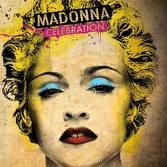
I researched different album covers and picked the ones i liked the most to add to my blog. I like these particular because they are photographs that have been edited on photoshop to make them look individual and interesting. The first one i like because it seems more like a drawing than a photograph, so it keeps you wondering how it was created. The second cover is a black and white outlined photo but the added yellow makes the photo vibrant and stand out. The third has a black and white effect which looks interesting. The fourth and final album cover has a really good effect, its a photograph with a sort of paper effect which i feel is very effective and original.
Wednesday, 10 November 2010
Flyer and Poster Design Research
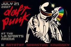
Also the 'social distortion' poster is has been drawn and edited to give a cartoon effect and i think the band chose this idea because they felt it portrays them.
The great nusa camp out is using block colours and a simple design using the silhuette of a man, which i think is very effective.
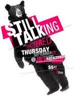
The still talking poster is my favorite because its simple and tells the audience what its about its simple, bold and to the point.
Wednesday, 3 November 2010
Subscribe to:
Comments (Atom)


