

Also the 'social distortion' poster is has been drawn and edited to give a cartoon effect and i think the band chose this idea because they felt it portrays them.
The great nusa camp out is using block colours and a simple design using the silhuette of a man, which i think is very effective.
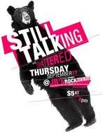
The still talking poster is my favorite because its simple and tells the audience what its about its simple, bold and to the point.
No comments:
Post a Comment