
Wednesday, 15 December 2010
cd cover
For my CD cover artwork i decided to produce it in a old punk style in black and white with red font. I used a stencil-like font and used my boyfriend as the model. I used him because he has a mohawk and he suited the punk theme to my album artwork. I tried to create it similar to the album cover shown below.

Monday, 13 December 2010

Wednesday, 24 November 2010
24th November 2010
Today we have printed our group photos onto assitate paper to use in the dark room. We then thought of some poems or quotes we could use to put with the photos, i chose the words ' strength in numbers'. We then added them to our photos to give an album cover effect which we used as a practice guide for our final album cover design.
Album cover research

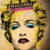


I researched different album covers and picked the ones i liked the most to add to my blog. I like these particular because they are photographs that have been edited on photoshop to make them look individual and interesting. The first one i like because it seems more like a drawing than a photograph, so it keeps you wondering how it was created. The second cover is a black and white outlined photo but the added yellow makes the photo vibrant and stand out. The third has a black and white effect which looks interesting. The fourth and final album cover has a really good effect, its a photograph with a sort of paper effect which i feel is very effective and original.
Wednesday, 10 November 2010
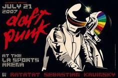
Flyer and Poster Design Research


Also the 'social distortion' poster is has been drawn and edited to give a cartoon effect and i think the band chose this idea because they felt it portrays them.
The great nusa camp out is using block colours and a simple design using the silhuette of a man, which i think is very effective.
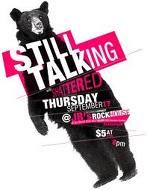
The still talking poster is my favorite because its simple and tells the audience what its about its simple, bold and to the point.
Wednesday, 3 November 2010

Wednesday, 20 October 2010
Evaluation
Firstly i picked a band for my research 'The Pretty Reckless' i found some information about the band and the lead singer. Then i added fashion photos of the lead singer 'Taylor Momsen' onto my blog. These are good because her clothes show her attitude and in some way describes her music style, i like this because it does all of this in a photograph.
I then added a blog about a music photographer 'Paul Harries' because i liked his style of portrait photography. He has photographed many famous bands such as Slipknot, Lacuna Coil and Fall out boy.
The Next photographer i looked was 'Jake Garn' he is also a portrait photographer, however uses unusual props which is why i feel his photography is inspiring.
I then decided to look at the background i would use for my own photography, so i looked at landscape photography and i found some dark photos of trees and water that i feel would make a good background.
The last photography i have looked at is 'The Seven Deadly Sins' which i found really interesting because the photos are simple portraits however, have been edited using some kind of photo shop. This kind of photography is the most inspiring to me and what i would enjoy doing.
However my research could have been added to and more information given about the band i have chosen. More example photos could have been added to my blog to show a wider range of ideas i found interesting.
Wednesday, 13 October 2010
7 deadly sins
The Seven Deadly Sins is quite a great concept in Photography and Design. Many photographers, designers are using the seven deadly sins for scary and gothic theme.
The Seven Deadly Sins, also known as the Capital Vices or Cardinal Sins, is a classification of the most objectionable vices which has been used since early Catholic times to educate and instruct followers concerning (immoral) fallen man’s tendency to sin. The final version of the list consists of wrath, greed, sloth, pride, lust, envy, and gluttony.The Catholic Church divided sin into two principal categories: “Venial sins”, which are relatively minor, and could be forgiven through any Sacramentals or Sacraments of the church, and the more severe “Capital” or Mortal sins. Mortal sins destroyed the life of grace, and created the threat of eternal damnation unless either absolved through the sacrament of Confession, or forgiven through perfect contrition on the part of the penitent.Beginning in the early 14th century, the popularity of the seven deadly sins as a theme among European artists of the time eventually helped to ingrain them in many areas of Catholic culture and Catholic consciousness in general throughout the world. One means of such ingraining was the creation of the mnemonic “SALIGIA” based on the first letters in Latin of the seven deadly sins: superbia, avaritia, luxuria, invidia, gula, ira, acedia
Seven Deadly Sins Photography
Seven Deadly Sins
 Lust
Lust Gluttony
 Sloth
Sloth Wrath
Wrath
 Lust
Lust Gluttony
 Sloth
Sloth Wrath
WrathThese photos have been edited using photoshop, the particular artist or photographer could not be found however, the same model is used in each photo. I most like the textured backgrounds of the images because it gives an old or 'worn' effect. The focal point of each photo is the woman. As you can see she is set in each photo in very similar poses yet each photo successfully shows the sin it is portraying.
The colors used are dark and shadows are used to give an 'eerie' effect. 'Sloth' is my favorite image because of all the different props used i.e all the different clock styles.
Dark lanscapes


These photos are the work of a talented photographer N.Salventius. His work is dark and eerie and is inspirational to me. Also the shadow and depth in this landscape photography makes he photos very effective.
Wednesday, 6 October 2010
Jake Garn- photographer


Jake Garn
Beauty & Fashion Photography
Specializing in commercial, beauty, and fashion photography, Jake Garn is passionate about education and shares many techniques through blog posts and photography workshops. Based near Salt Lake City Utah.
Wednesday, 29 September 2010
Paul Harries
Paul Harries Interview
PAUL HARRIES
1. How long have you been a professional photographer?
17 years
2. Where can people see your work?
Kerrang magazine and www.paulharries.com
3. Who are your favourite photographers?
Bob Carlos Clarke RIP
4. What made you decide to pursue photography as a career?
It beats working in an office, I know I did it for long enough.
5. Did you study photography at college/uni or are you self-taught?
Self taught
6. Why did you decide to specialize in music photography?
I love music and I cant sing or play anything.
7. What was the turning point that helped you get recognized for your work?
Kerrang needed a photographer fast and a friend recomended me.
8. What perks do you enjoy from your work?
Seeing my shots in print every week and the odd free CD.
9. How many live gigs would you shoot in an average week?
1 or 2
10. What are your favourite lenses for concert work?
28 to 135 zoom and 10 to 22 zoom
11. Whats your top tip for concert photographers?
Be nice to security and they will be nice to you.
12. Are there any artists do you particularly enjoy photographing? If so, why?
Anyone with a good image that enjoys being photographed.
13. Ever had any disasters during a shoot?
My lights failed during a Marilyn Manson shoot.
14. Where do you do the majority of portrait sessions?
Studios, backstage and hotels.
15. In what way does your kit differ from live work to portraits?
When I shot film I would use medium format for portraits but now i use my digital slr for everything.
16. What kind of photography do you enjoy when youre not working?
My 4 year old son is a great subject.
17. Do you work with agencies or just magazines?
Mostly Kerrang magazine but I have an agent who puts out photos to magazines abroad.
18. What photograph are you most proud of and why?
The photo of Ville Valo with the mask, he got so into it. Also my shoots with Slipknot.....masks again.
19. Film or digital? I was resistant but digital
20. Are you considering having your own website?
see www.paulharries.com
21. Ever been commissioned for anything particularly unusual?
Bernard Manning in his underpants...beat that!
22. Whats the highlight of your career so far?
Getting a good reputation.
23. What would you still like to achieve with your photography?
To keep going and get better
Music Photographer - Paul Harries
Paul Harries
Internationally renowned London based photographer, Paul Harries has photographed the worlds most celebrated musicians in the world of rock. Having worked freelance for over twenty years, predominantly for Kerrang!
Paul's portfolio such luminaries as Nirvana, Foo Fighters, Metallica, Slipknot, Green Day and Fallout Boy. With his undoubted talent and ability to see the world just that little bit differently.


Wednesday, 22 September 2010
The Pretty Reckless
The Pretty Reckless is a rock band from New York City that was formed and fronted by american actress, musician and model Taylor Momsen. Other members include Ben Phillips (guitar), Mark Damon (bass) and Jamie Perkins (drums).
The band was originally going to be called 'The Reckless' but was then changed to 'The Pretty Reckless' due to trademark problems.
Their debut album 'light me up' was released on August 30, 2010 in the UK. They released their first single 'make me wanna die' on May 13, 2010. The single peaked at number 1 on the UK Rock chart and was received with positive reviews.
Taylor Momsen has done a complete 180 when it comes to her fashion. She has gone from girly dresses and frilly tops and replaced them with ripped tights, heavy eyeliner and garter belts.
I love Taylors style because its extreme, its inspiring because of her styles edgy attitude. Taylor does the Rock Chic look and she does it well.
Subscribe to:
Comments (Atom)